
Responsive web design is an approach to web development that makes websites adapt to different screen sizes and devices.
It uses flexible layouts, images, and CSS media queries to provide a consistent user experience.The goal is to make websites fast, accessible, mobile-friendly, and easy to use on all devices
“Responsive Web Design always plays an important role whenever going to promote your website.” – Josh Wilson
“There are three responses to a piece of design – yes, no, and WOW! Wow is the one to aim for.” –Milton Glaser
“I strive for two things in design: simplicity and clarity. Great design is born of those two things.” — Lindon Leader
What Is Responsive Web Design?
At its core, responsive design is a decision to let content define layout, rather than forcing content into a fixed-width box. A page built this way doesn’t have “a mobile version” and “a desktop version” – it has one structure that flexes.
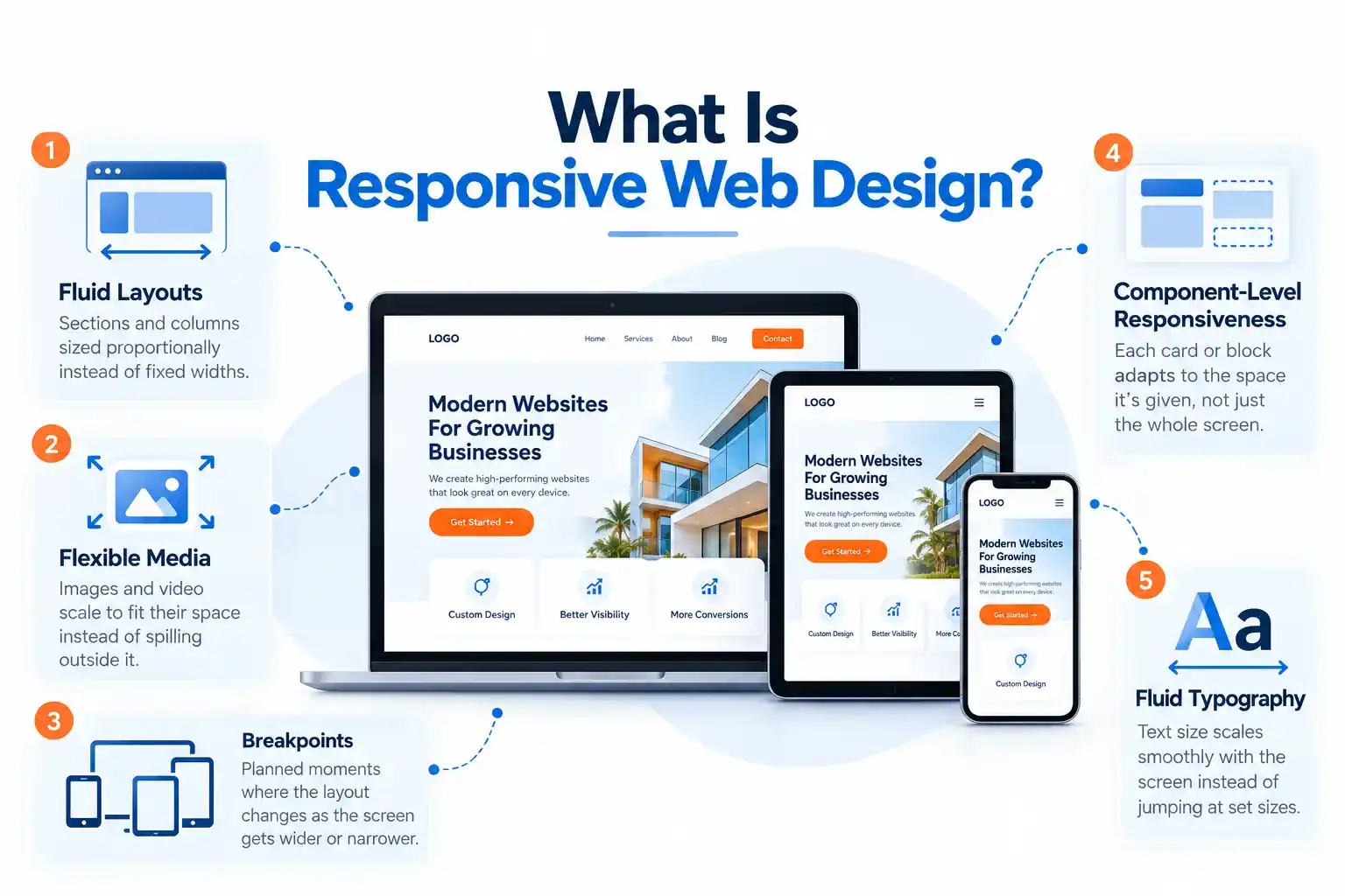
Three ingredients make this possible:
- Fluid layouts – sections and columns sized proportionally instead of at fixed widths
- Flexible media – images and video that scale to fit their space instead of spilling outside it
- Breakpoints – planned moments where the layout itself changes shape as the screen gets wider or narrower
As of 2026, two more ideas belong on that list: component-level responsiveness, where an individual card or block adapts to the space it’s given rather than the whole screen, and fluid typography, where text size scales smoothly with the screen instead of jumping abruptly at set sizes
Fluid Layouts vs. Fixed Layouts
Before responsive design, websites tended to be one single width. Most website designers would build sites for the standard of 960 pixels wide. At 960 pixels, it leaves a lot of empty space on larger displays while it causes a horizontal scroll bar or zooming to read text on smaller displays.
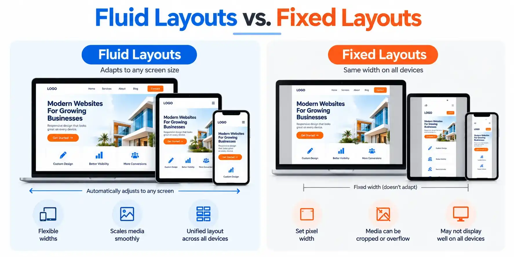
A fluid layout means replacing this fixed width with a flexible one. The page can be made to display as large as possible on a display, but there are fixed boundaries. This means the website will not be too wide for a large display nor too small and cramped for a mobile display. It is closer in design to a canvas that displays wider to the space on the wall it is being viewed on compared to a picture frame that is always the same size.
How Responsive Web Design Works?
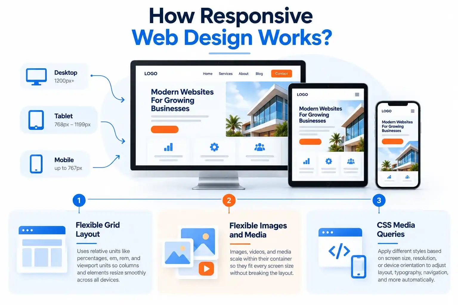
Responsive web design combines several techniques to help a website adapt smoothly to different screen sizes and devices. Instead of creating separate websites for desktop, tablet, and mobile users, a responsive website uses flexible layouts, scalable media, and CSS media queries to adjust its appearance automatically.
Flexible Grid Layout
A flexible grid provides the structural foundation of a responsive website. Instead of relying heavily on fixed pixel widths, responsive layouts use relative units such as percentages, em, rem, and viewport-based units.
This allows columns, containers, and other page elements to expand or shrink as the available screen space changes. Content can therefore flow naturally across desktop, tablet, and mobile screens without overlapping or breaking the layout.
A flexible grid also makes a website easier to maintain and better prepared for new screen sizes and devices.
Flexible Images and Media
Images, videos, and other media need to adapt along with the surrounding layout. Responsive web design uses CSS techniques to make media scale within its container rather than extending beyond the screen.
For example, a large image can automatically shrink on a smartphone while maintaining its original proportions. This prevents distorted images, horizontal scrolling, and crowded layouts.
Properly optimized responsive images can also improve page speed and provide a better user experience, particularly for visitors using mobile devices.
CSS Media Queries
CSS media queries determine when a responsive website should change its layout or styling. They allow developers to apply different CSS rules based on conditions such as screen width, height, resolution, or device orientation.
For example, a desktop website might display three columns, while the same content could automatically switch to a single-column layout on a smaller smartphone screen.
Media queries make it possible to adapt navigation, typography, spacing, images, and other design elements without creating separate versions of the same content. They are one of the core technologies behind modern responsive web design.
How to make a website mobile friendly
Mobile-first design means designing for the smallest, most constrained screen first, then adding complexity as more space becomes available – rather than designing a full desktop layout and stripping it down for mobile afterward.
This isn’t just a workflow preference. Starting from the smallest screen forces an honest answer to “what does this page actually need?” before there’s room to avoid that question. It’s much easier to add a second column later than to decide, under deadline, what to cut from an already-finished desktop design.
In practice, this means: on a phone, the navigation menu is tucked behind a menu icon by default. As the screen grows past roughly tablet width, the full menu appears and the icon disappears. Designing this way – adding things as space allows, rather than removing things as space runs out – tends to produce cleaner, more intentional mobile layouts.
A Practical Responsive Design Workflow
A repeatable process avoids most of the problems that surface later in testing:
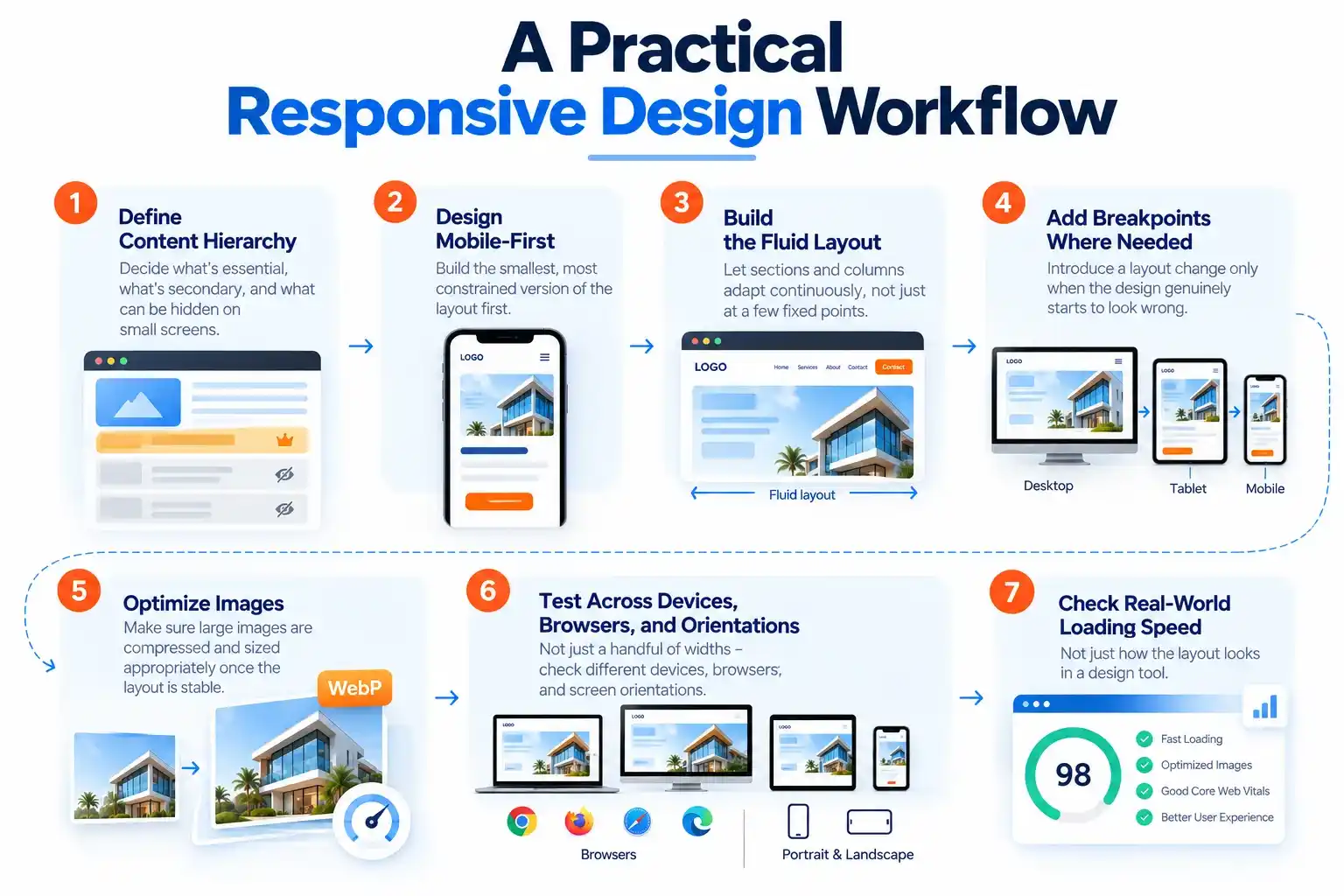
- Define content hierarchy. Decide what’s essential, what’s secondary, and what can be tucked behind an interaction (a drawer, accordion, or “show more”) on small screens.
- Design mobile-first. Build the smallest, most constrained version of the layout first.
- Build the fluid layout. Let sections and columns adapt continuously, not just at a few fixed points.
- Add breakpoints where content actually breaks. Introduce a layout change only once the design genuinely starts to look wrong – not preemptively at a device size someone picked in advance.
- Optimize images. Make sure large images are compressed and sized appropriately once the layout is stable.
- Test across devices, browsers, and orientations. Not just a handful of widths – see the testing section below.
- Check real-world loading speed, not just how the layout looks in a design tool.
Content-Driven Breakpoints, Not Device-Driven Ones
A common mistake is treating layout changes as fixed rules tied to specific devices – for example, hard-coding a change at exactly 500px because that’s “tablet size.” Device dimensions change constantly; content doesn’t.
The right approach: build the fluid layout first, then shrink and expand the window slowly and watch for the point where the design itself starts to look wrong — text lines getting too long, elements crowding together, or excessive empty space. That’s where a breakpoint belongs, not at a number picked in advance.
That said, it helps to have reference points when sketching a first draft:
| Range | Typical context |
|---|---|
| 360–480px | Small phones |
| 481–767px | Large phones, phones in landscape |
| 768–1023px | Tablets |
| 1024–1279px | Small laptops |
| 1280px+ | Desktop monitors |
Treat this table as a sketch, not a spec — the final breakpoints should come from testing the actual design, not from this list.
Responsive Typography
Typography is often the last thing considered for different screens, but line length and font size have an outsized effect on readability.
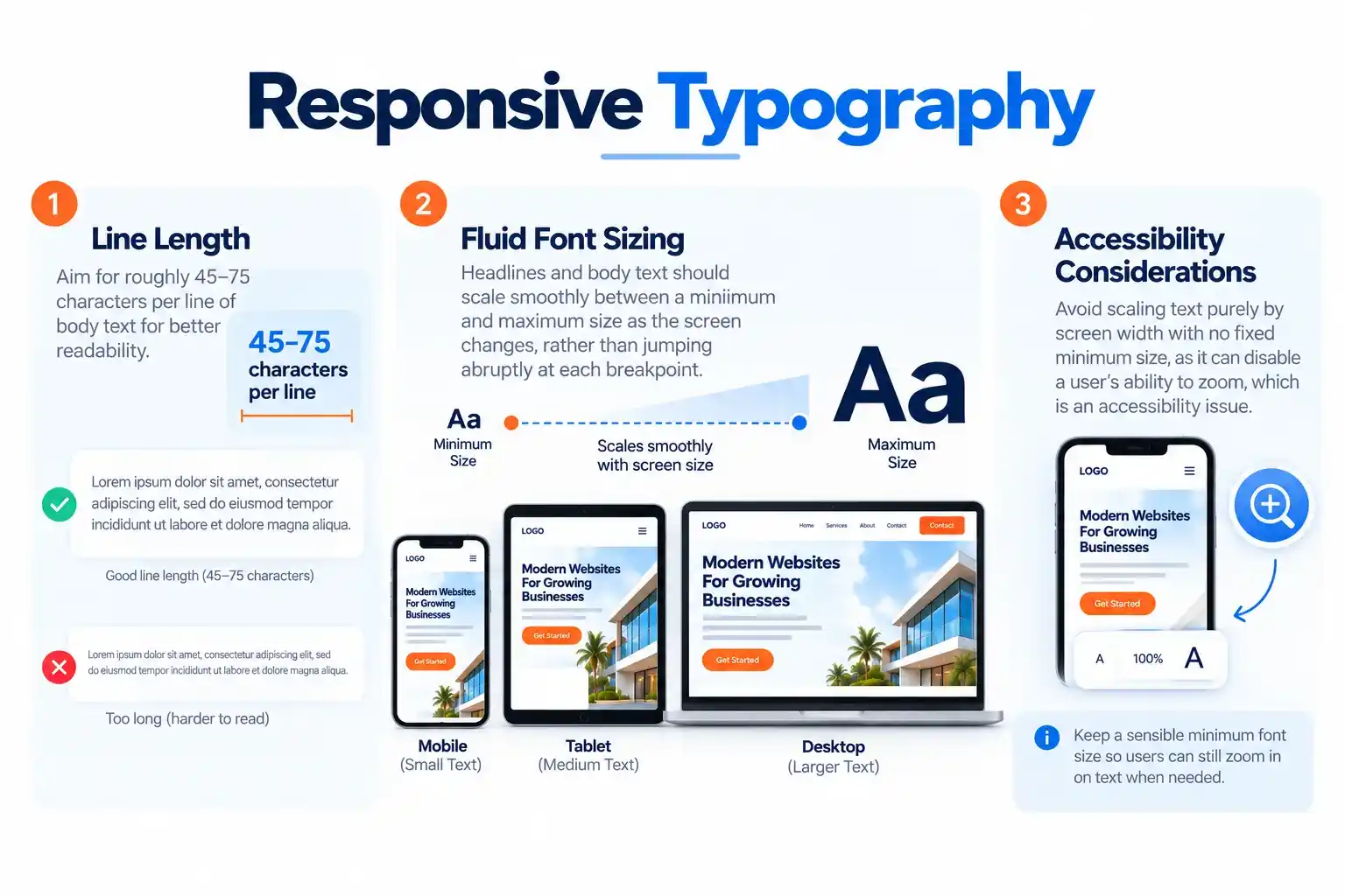
- Line length: aim for roughly 45–75 characters per line of body text. Wider than that, and the eye has trouble tracking back to the start of the next line – a common problem on wide desktop screens with unconstrained text blocks.
- Fluid font sizing: headline and body text should scale smoothly between a minimum and maximum size as the screen changes, rather than jumping abruptly at each breakpoint. This keeps headlines readable on a phone without looking oversized on desktop, and vice versa.
- A caution on scaling text purely by screen width: if text size is tied only to the viewport with no fixed floor, it can disable a user’s ability to zoom in on that text – a real accessibility problem, and one worth flagging to a developer during handoff.
Responsive Images and Media
The baseline rule: images and video should never be wider than the space they’re placed in — they should shrink to fit, never spill outside their container or force the page to scroll sideways.
Beyond that, two ideas matter for design decisions specifically:
- Serving the right size image per device. A large desktop hero image doesn’t need to load at full size on a phone. This is a development/performance concern, but it starts with the designer providing images at multiple resolutions rather than one oversized master file.
- Art direction for different screens. Sometimes the best image for mobile isn’t just a shrunk version of the desktop image – it’s a different crop entirely. A wide landscape hero photo might need a tall, tighter portrait crop on mobile so the subject isn’t lost. Planning both crops during design, rather than leaving it to development, produces a much stronger mobile experience.
Always design with final image dimensions and aspect ratios in mind so nothing shifts or jumps once real images load in.
Responsive Navigation Patterns
Navigation is one of the first things to break on small screens if it isn’t planned for.
- Hamburger menu / drawer – the most common pattern: a menu icon reveals a full-screen or slide-in navigation panel on mobile, while desktop shows links inline.
- Priority navigation – shows as many top-level links as comfortably fit the available width, tucking the rest into a “more” menu. Useful for sites with long navigation bars.
- Bottom navigation – common on mobile-heavy apps and sites, keeping core actions within thumb reach at the bottom of the screen instead of the top.
Whichever pattern is used, keep at least one always-visible entry point – home, search, or a call button – so users are never fully “stuck” inside a collapsed menu.
Touch Interaction and Tap Target Sizing
Desktop interactions use a precise cursor; mobile interactions use an imprecise fingertip. Design decisions need to account for that difference:
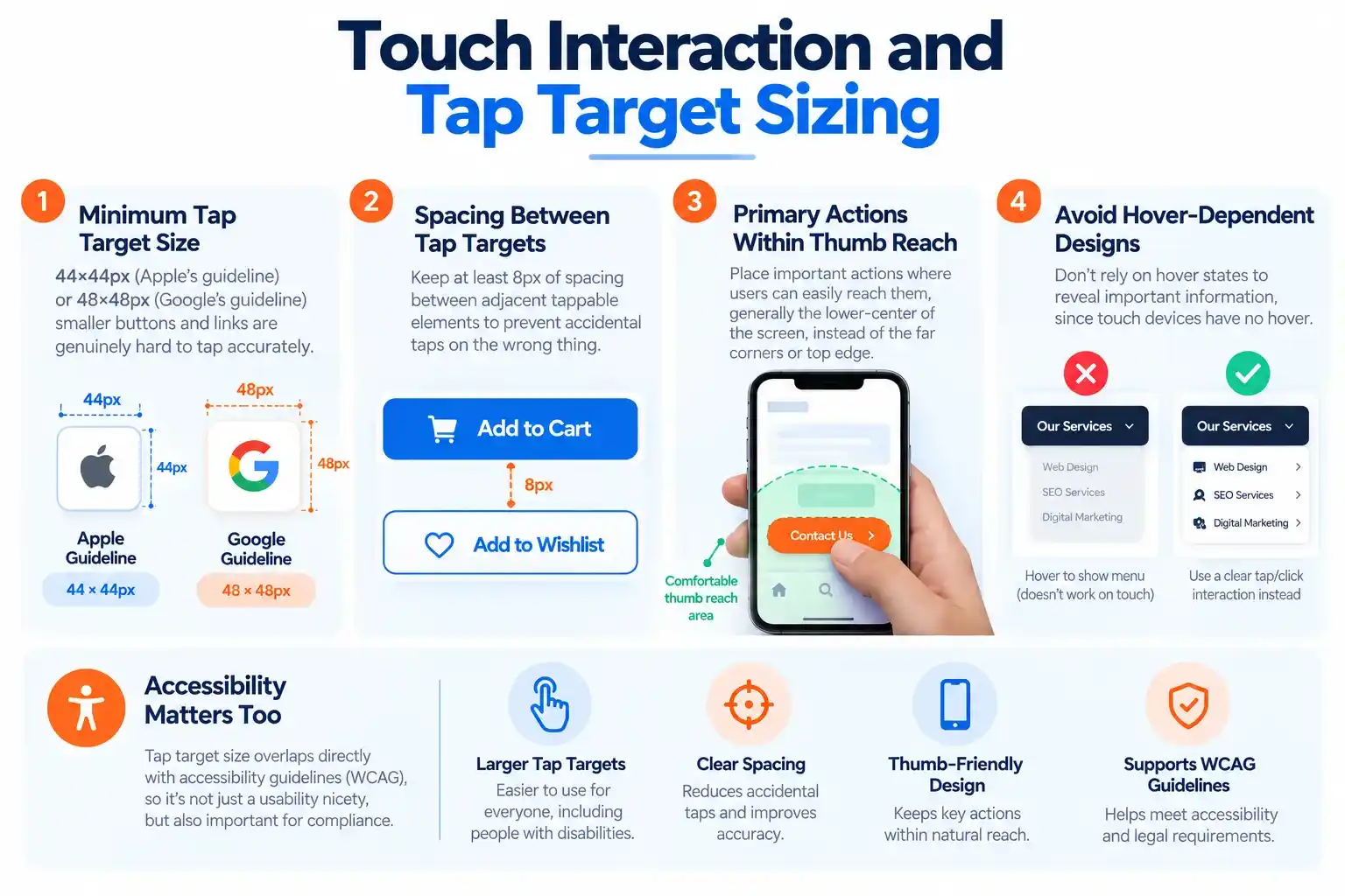
- Minimum tap target size: 44×44px (Apple’s guideline) or 48×48px (Google’s guideline) – smaller buttons and links are genuinely hard to tap accurately.
- At least 8px of spacing between adjacent tappable elements, to prevent accidental taps on the wrong thing.
- Primary actions within comfortable thumb reach – generally the lower-center of the screen – rather than the far corners or top edge.
- Avoid designs that depend on hover states to reveal information, since touch devices have no hover.
This isn’t just a usability nicety – tap target size overlaps directly with accessibility guidelines (WCAG), so it matters for compliance too.
Responsive Forms
Forms are one of the highest-friction elements on mobile, and one of the most commonly overlooked in responsive design work.
- Stack labels above inputs on narrow screens rather than placing them side-by-side, which cramps both.
- Use full-width inputs and buttons on mobile so they’re easy to tap accurately.
- Design fields so the right keyboard appears automatically on mobile (a numeric keypad for a phone number field, for example) – a detail worth calling out to development.
- Break long, multi-step forms into fewer fields per screen on mobile rather than one long scroll.
- Keep error messages inline and visible without requiring the user to scroll back up to find them.
Responsive Tables
Data tables don’t naturally reflow – a wide table on a narrow screen either overflows or becomes unreadable. Two common solutions to design for:
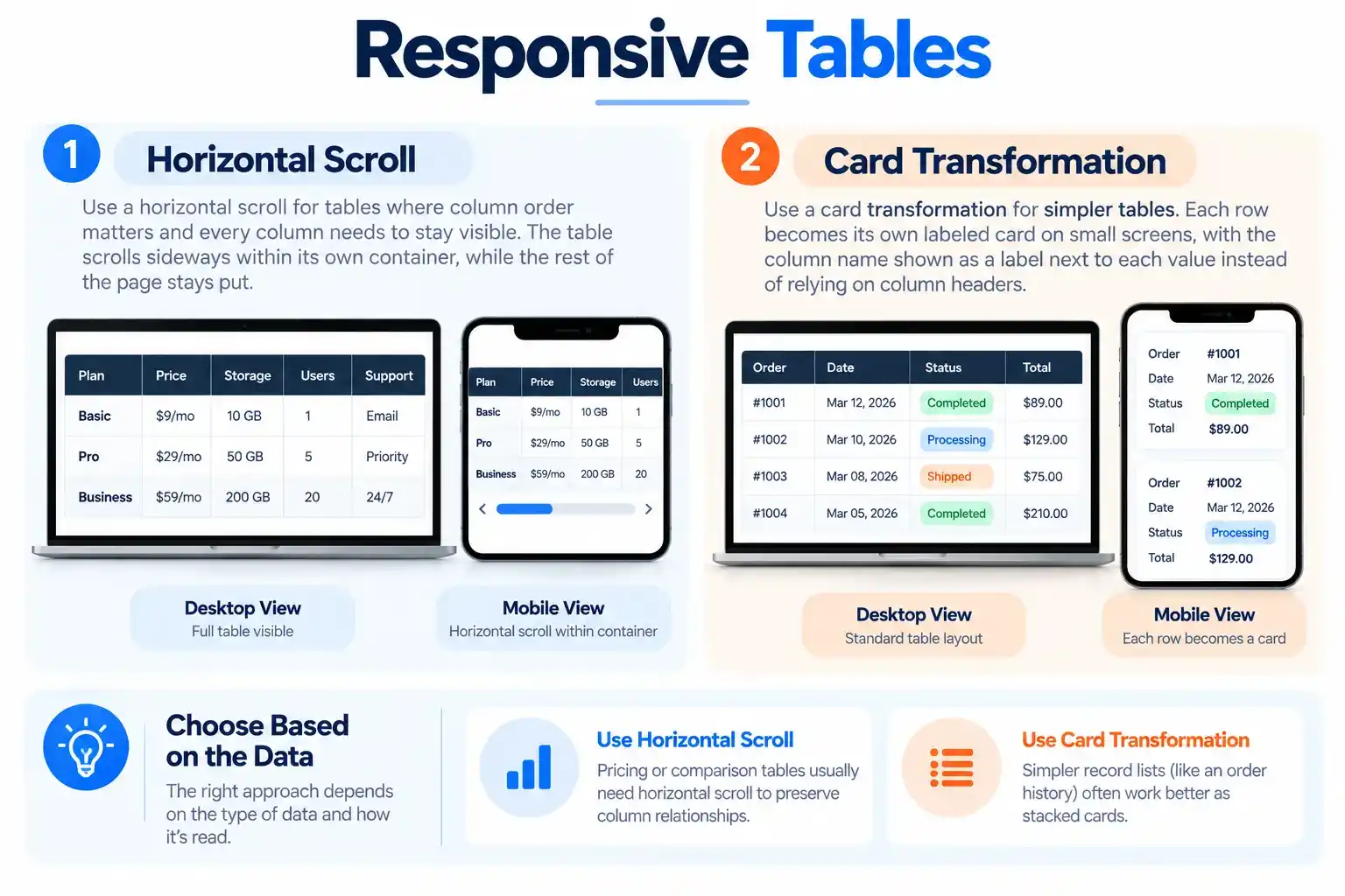
- Horizontal scroll, for tables where column order matters and every column needs to stay visible – the table scrolls sideways within its own contained box, while the rest of the page stays put.
- Card transformation, for simpler tables – each row becomes its own labeled card on small screens, with the column name shown as a label next to each value instead of relying on column headers lining up above.
Choose based on the data: pricing or comparison tables usually need horizontal scroll to preserve column relationships; simpler record lists (like an order history) often work better as stacked cards.
Content Prioritization Across Screen Sizes
Responsive design is not simply “shrink the desktop layout.” Screen space is a hierarchy problem: a desktop page can show a hero, three supporting sections, and a sidebar all above the fold, while a phone can realistically show one of those at a time.
That means content order and visibility should be a deliberate design decision, not an afterthought:
- Identify the one or two actions a mobile visitor is most likely trying to complete, and make sure nothing sits between them and that action.
- Move secondary content – related links, extended details – behind progressive-disclosure patterns like accordions, “read more,” or tabs, rather than deleting it outright.
- Content that’s simply hidden on mobile with no path to reveal it may not count for search rankings – see the SEO section below.
The Viewport Setting
There’s one small but critical technical setting that every responsive site needs, regardless of how well it’s designed: a line of code (added by the developer) that tells a phone’s browser to display the page at the phone’s actual screen width, instead of rendering it like a shrunk-down desktop page. Without it, every other responsive decision on the page fails to work as intended. Worth confirming with a developer that it’s in place, especially on a redesign or platform migration.
Accessibility in Responsive Design
Responsive layouts and accessible layouts overlap more than they’re often given credit for.
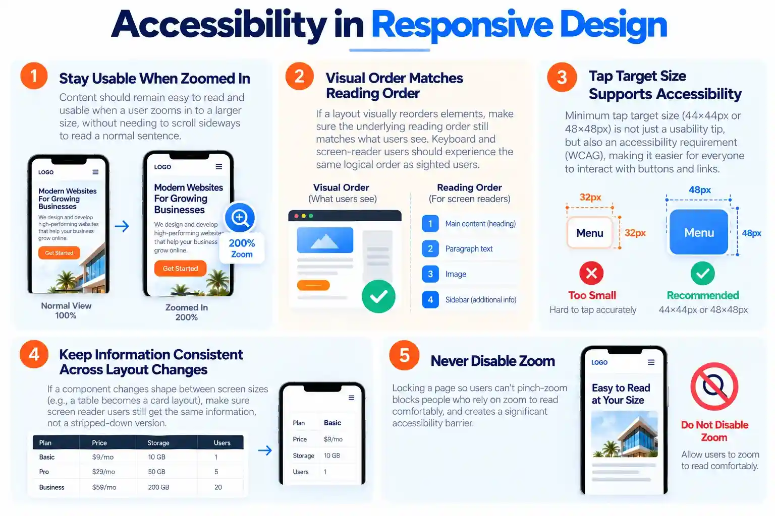
- Content should stay usable when a user zooms in to read at a larger size, without needing to scroll sideways to read a normal sentence.
- Visual order and reading order should match. If a layout visually reorders elements (say, a sidebar appears before the main content on desktop but after it in the underlying structure), keyboard and screen-reader users can end up navigating in a different order than sighted mouse users see — worth testing, not just eyeballing.
- Tap target size doubles as an accessibility requirement, not just a usability nicety.
- If a component changes shape between screen sizes — a table becoming a card layout, for instance — make sure screen reader users still get the same information either way, not a stripped-down version.
- Never disable zoom. Locking a page so users can’t pinch-zoom blocks people who rely on zoom to read comfortably.
Performance Considerations
A responsive layout that looks correct but loads slowly on mobile still fails the user.
- Lazy-load below-the-fold images and video with loading=”lazy”, and reserve their space with width/height or aspect-ratio to avoid layout shift once they load.
- Split critical CSS so the styles needed for the initial viewport load first, deferring the rest.
- Use resource hints (preload for the hero image, preconnect for third-party origins) to shorten the critical rendering path.
- Cache aggressively for static assets, and serve images through a CDN that can generate the right size on the fly rather than shipping one oversized file to every device.
- Audit third-party scripts. Chat widgets, analytics, and embeds are a common source of mobile performance problems that have nothing to do with layout code.
Core Web Vitals and Responsive Design
Responsive decisions map directly onto Google’s three Core Web Vitals:
| Metric | What it measures | How responsive design affects it |
|---|---|---|
| LCP (Largest Contentful Paint) | How fast the main content loads | Oversized hero images and unoptimized fonts are common mobile LCP problems |
| CLS (Cumulative Layout Shift) | How much the layout jumps during load | Missing width/height on images, and late-loading ads or embeds, are the usual cause |
| INP (Interaction to Next Paint) | How quickly the page responds to interaction | Heavy JavaScript-driven layout changes (menus, accordions) can delay response on lower-powered mobile devices |
These aren’t a separate concern -responsive design – they’re a direct measurement of how well it was implemented.
Responsive Design and SEO
The relationship is more specific than “Google likes mobile-friendly sites”:
- Mobile-first indexing means Google primarily evaluates the mobile version of a page to determine rankings – including for people searching on desktop. If the mobile layout hides content that exists on desktop, that content may effectively not count toward rankings at all.
- Keep content equivalent across screen sizes. Tucking non-essential content behind an accordion on mobile is fine; removing it entirely, or showing a different page title on mobile, is not.
- A single responsive site (not a separate mobile domain) avoids duplicate-content risk and the ongoing maintenance burden of keeping two versions in sync.
- Page speed is a ranking factor, not just a UX nicety – a beautifully designed page that loads slowly on mobile still loses both visitors and search visibility.
Testing Responsive Websites
A layout that looks right in one browser at one width is not proof it’s responsive. A reasonable testing pass covers:
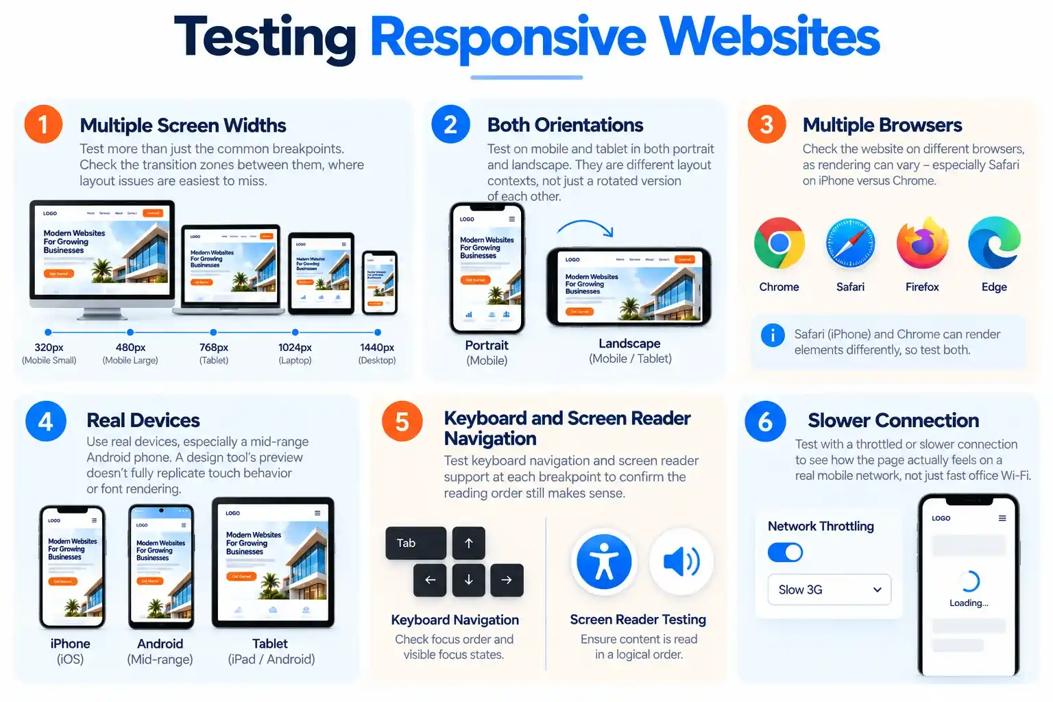
- Multiple screen widths, not just the common breakpoints – check the transition zones between them, where problems are easiest to miss.
- Both orientations on mobile and tablet – portrait and landscape are genuinely different layout contexts, not just a rotated version of each other.
- Multiple browsers, since rendering can differ meaningfully – particularly Safari on iPhone versus Chrome.
- Real devices, particularly a mid-range Android phone – a design tool’s preview or browser emulator doesn’t fully replicate real touch behavior or font rendering.
- Keyboard and screen reader navigation at each breakpoint, to confirm the reading order still makes sense.
- A throttled or slower connection, to see how the page actually feels on a real mobile network rather than fast office Wi-Fi.
Common Responsive Design Mistakes
- Designing desktop-first, then compressing it for mobile. This tends to produce cramped, over-stuffed mobile layouts because the content wasn’t prioritized with mobile’s constraints in mind from the start.
- Hiding content and assuming it’s “gone” for good. For SEO and accessibility, content that’s hidden may not count as present at all – use progressive disclosure instead of outright removal.
- Treating breakpoints as fixed device targets rather than testing where the design actually breaks.
- Ignoring landscape orientation on mobile and tablet, which is a genuinely different layout context, not just a wider portrait view.
- Skipping real-device testing in favor of a design tool’s preview alone.
- Leaving forms and tables unaddressed, since neither reflows automatically the way text and images do.
- Ignoring load speed, so a beautifully designed layout still loads too slowly to be usable on a real mobile connection.
Responsive Desgn in Practice
E-commerce: the product image and price stay the visual priority at every screen size. On mobile, the “Add to Cart” action is typically pinned to the bottom of the screen so it’s reachable without scrolling, and filters move into a full-screen overlay rather than a permanent sidebar.
SaaS dashboards: the hardest responsive case, since data tables and charts don’t naturally reflow. Better implementations shrink a chart down to a simplified summary card at narrow widths, and convert data tables into labeled card stacks on mobile rather than shrinking every column into illegibility.
Local service businesses (contractors, law firms, dental and medical practices, restaurants): the click-to-call phone number and the “Request a Quote” or “Book Now” action need to stay visible without scrolling on mobile, since a large share of local search traffic converts by phone or a short form rather than browsing multiple pages. A responsive layout that buries the phone number below a long scroll on mobile is losing calls a desktop-only design wouldn’t lose.
Content and blog sites: multi-column layouts collapse into a single readable column, images resize within their container, and navigation moves into a collapsible menu — while line length and font size stay controlled at every width.
Responsive Web Design Checklist
- Content hierarchy defined before layout work starts
- Design built mobile-first, then enhanced for larger screens
- Breakpoints placed where content actually breaks, not at arbitrary device widths
- Phone-scale viewport setting confirmed with development
- Images sized and cropped appropriately for each screen, with art direction considered for hero/feature images
- Typography scales fluidly and line length stays readable at every width
- Navigation has a working collapsed pattern with at least one always-visible entry point
- Tap targets are at least 44×44px with adequate spacing
- Forms stack on mobile, use appropriate input types, and keep errors visible
- Tables use horizontal scroll or a card layout on narrow screens
- No horizontal scrolling at any tested width
- Reading order and content parity verified across breakpoints
- Tested on real devices, multiple browsers, and both orientations
- Page speed measured under realistic mobile conditions
Frequently Asked Questions
Building a website so its layout, typography, and media automatically adjust to fit any screen size – all from a single design and codebase, rather than separate mobile and desktop versions.
It affects usability, Google’s mobile-first search rankings, page speed, and conversions – a site that’s hard to use on a phone loses visitors and search visibility at the same time.
Rough starting ranges are 360–480px (small phones), 481–767px (large phones), 768–1023px (tablets), 1024–1279px (small laptops), and 1280px+ (desktop) – but the right breakpoints for any given design come from testing where the content itself starts to break, not from a fixed list.
For most businesses, yes. A single responsive site avoids duplicate-content issues, is far cheaper to maintain long-term, and aligns with how Google’s mobile-first indexing evaluates a site.
Responsive layouts resize continuously across the full range of screen sizes. Adaptive layouts switch between a fixed set of pre-built layouts at specific breakpoints. Responsive is generally easier to maintain long-term.
Yes – minimum tap target size overlaps directly with accessibility guidelines, not just general mobile usability advice.
Getting Responsive Design Right for Your Business
Most of the mistakes above aren’t about missing design skill – they’re about responsive behavior being treated as a one-time task rather than an ongoing property of the site. A mobile-first design process with a defined testing pass catches these issues before launch, rather than after a customer reports a broken checkout on their phone.
If your current site shows any of the problems covered here – a buried phone number on mobile, tables that break on phones, or a layout that was never truly tested past a browser resize – a focused audit is usually the fastest way to find out what’s actually costing you conversions, before committing to a full rebuild.
Summary
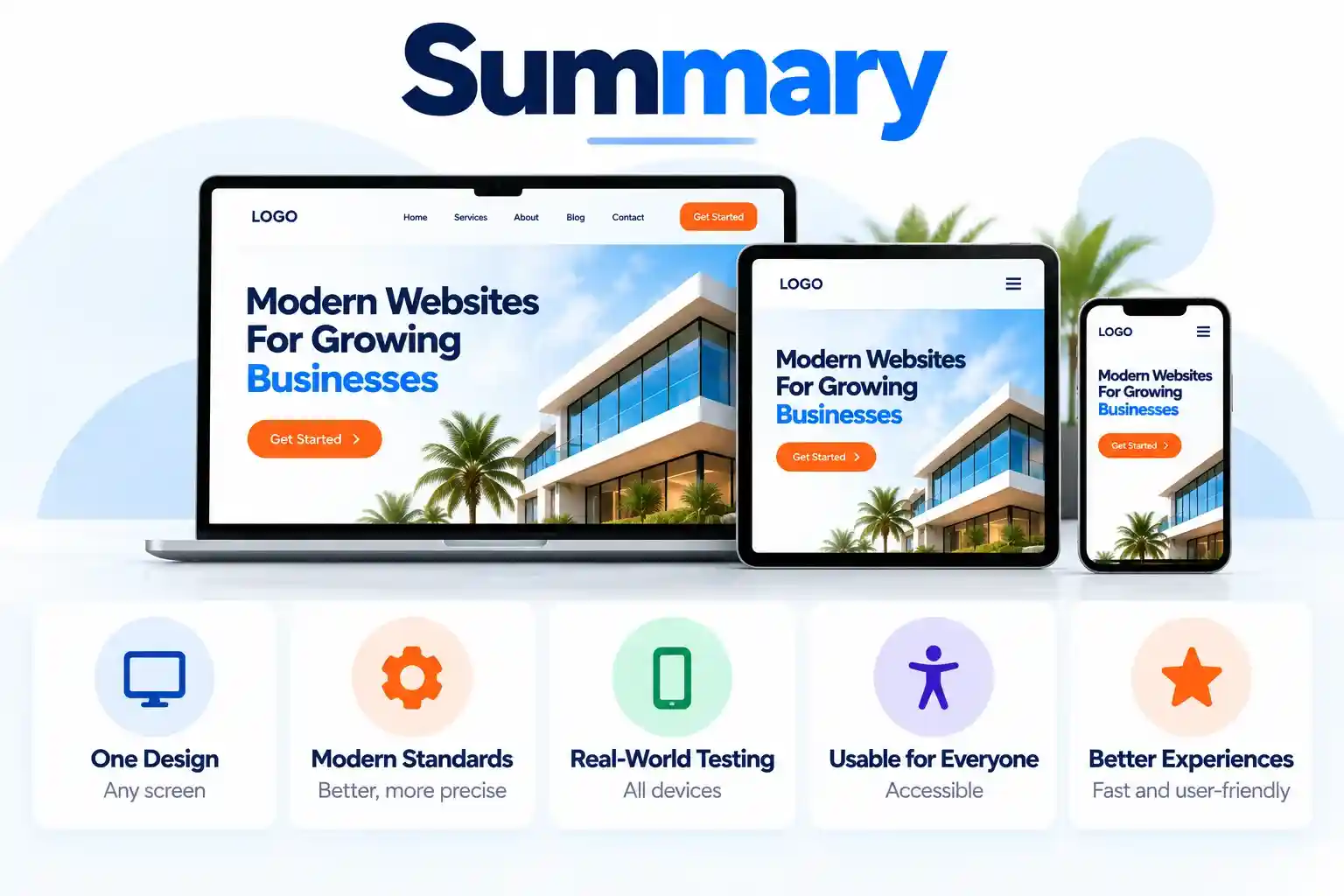
Responsive web design hasn’t changed in its core goal since 2010 – one design, adapting to any screen – but the standards for doing it well in 2026 are more precise than ever: component-level responsiveness, fluid typography, and a testing process that goes well beyond resizing a browser window and calling it done. The checklist above is a reasonable working definition of what “responsive” should mean in practice.